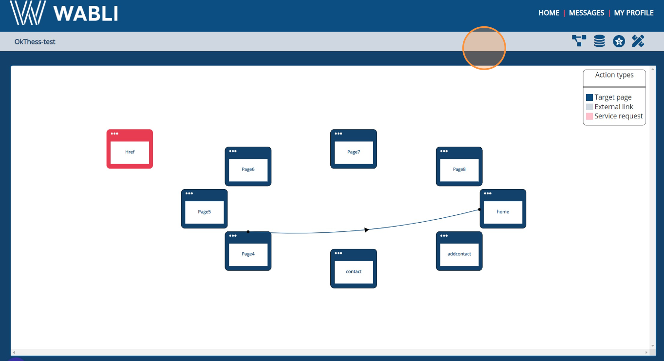
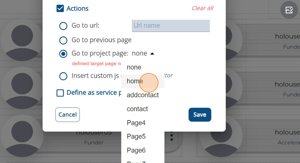
contact@wabli.eu +30 2310365188

Core concepts Last updated: 2023-08-22

To construct a web application using WABLI, there are four fundamental steps that need to be followed. In this guide, we will comprehensively guide you into these steps, providing an in-depth analysis and offering you a step-by-step walkthrough for understanding WABLI and its tools in order to create any type of application.

Design

To begin, you need to formulate the design of your application. Utilizing the drag-and-drop functionality of a vast array of pre-developed components that have been provided for your convenience, you can effortlessly construct a wide variety of pages. Additionally, you have the freedom to personalize the appearance of these components according to your preferences, enabling you to craft pages that suit your specific requirements.

Design Page

Page Flow

After making your pages, it's time to link them together. You'll decide how people move from one page to another and how they can easily go back and forth between them. This makes sure that all the pages are accesible and that using the app feels smooth and simple for everyone.

Page Flow

Data Model

With your pages all set up and linked together, the next step is to shape the kind of information you want to display. This involves designing your data model. You'll pick a name for organizing your data in the database and outline its distinctive features. After this, WABLI will generate the necessary functions to showcase your data. Your role is to simply choose where these functions will be active, and specify which data gets displayed on each page. It's a smooth process that puts you in control of what your users see.

Data Model

Deployment

Congratulations, your project is good to go! You've got a couple of options now. You can either grab the code and use it on your own, or you can sync it up with your GitHub account. Once that's done, you're all set to deploy it to the server provided by the WABLI team. It's like putting the final touch on your creation and making it available for the world to see.

Deployment

Blocks

Blocks

Blocks serve as the building blocks, much like bricks when constructing a house. You assemble them one by one to create your web application, combining these modular components to form the structure and functionality of your project. Discovering the assortment of available blocks and learning how to utilize them is a crucial aspect of crafting your desired pages. Currently, WABLI offers an extensive collection of pre-designed components that you can freely utilize. These blocks are neatly categorized for your convenience, and in the following sections, we'll delve into a comprehensive analysis of each one.

Layout

Layouts are a key part of positioning your content blocks effectively. You have the option to opt for columns or straightforward boxes. The Styling section, below, provides insights into how to employ these layouts to achieve your desired block positioning. With layouts, you have the capability to create intricate designs while also ensuring responsiveness across different devices. It's not just about crafting complex visuals, but also about ensuring they adapt seamlessly across various screen sizes.

Before adding any other block, it's essential to include a layout block to ensure that you achieve your intended outcome. This foundational step guarantees that your design will align with your expectations.

Layout

Typography

Typography

Typography blocks include a comprehensive range of textual elements you might wish to integrate. Whether it's a heading, a paragraph, or even a link to another page, these blocks cover all your text-related requirements.

Begin by placing larger headings at the top of the page, typically using H1 tags, and gradually decrease their size as you proceed downwards. This hierarchy in heading sizes helps create a structured and visually pleasing layout.

Headers & Footers

Within this category, you'll find a selection of pre-designed headers and footers that are responsive, ready for your utilization. A header constitutes the upper menu section of a website, while a footer forms the concluding segment at the bottom of your page.

Remember to include headers and footers on each page to facilitate seamless navigation for users as they move between different sections of your app. These consistent headers and footers provide a sense of familiarity and ease, allowing users to explore and navigate your app effortlessly.

Headers & Footers

Components

Components

Components encompass a wide array of individual blocks that you may wish to integrate into your page. This encompasses a variety of elements such as images, modals, maps, cards, carousels, and numerous others, giving you the flexibility to incorporate diverse functionalities and visual enhancements into your design.

List Items & Tables

List Items and Tables encompass an array of blocks designed specifically for displaying data. Within this category, you'll find an assortment of block variations tailored to your needs, allowing you to select the most suitable options for showcasing your data in a manner that aligns with your preferences.

Utilize lists when presenting users, blog posts, tasks, and similar items. On the other hand, opt for tables when displaying data that you would typically organize in an Excel spreadsheet, offering a consistent and structured view for easy comprehension.

List Items Tables

Login & Register

Login & Register

The Login & Register section provides you with pre-designed components featuring login and registration forms that are ready to be implemented. Incorporate these components on your initial page to facilitate user login. For further enhancements and functionalities, refer to the Annotations section, where you can learn how to define additional features in this context.

Built In Components

The Built-In Components section offers an array of impressive and intricate designs that are readily available for your use. These designs encompass features such as user profiles, payment sections, comment areas, and many others. Integrating these components into your page is as simple as a few clicks, allowing you to elevate the visual appeal of your page effortlessly.

By incorporating these components, you eliminate the need to individually add distinct layouts, typography blocks, tables and more. Everything you require is seamlessly integrated through the addition of these components, streamlining your design process and providing a comprehensive solution in one step.

Built In Components

Built In Templates

Built In Templates

The Built-In Templates provide you with fully prepared and readily deployable complete pages. These templates encompass not only headers and footers but also a range of other essential elements required for a comprehensive webpage design. Of course, you can delete and keep only the parts you need.

Rather than commencing with a blank canvas, you have the option to kickstart your project by incorporating one of these blocks. You can then proceed to customize the page, tailoring it to your preferences and requirements. This approach accelerates your design process while allowing you the flexibility to mold the page according to your vision.

Extra

This last section, includes all the blocks you have created and saved for future use. To save one block, first select the block and then click on the plus icon.

Extra

Styling

Styling

Learning how to style your blocks is crucial for creating attractive and visually pleasing pages. The guide will take you through all the available option when styling a block.

General

General

In this section, you determine how your blocks are positioned.

When you choose 'static', the block follows the regular flow of the page.

With 'fixed', the element remains in the same place even when the page is scrolled you can control this using the top, right, bottom, and left properties.

For 'relative', the element shifts from its usual position, while other content won't adjust to fill gaps left by it.

An element with 'absolute' is positioned relative to its closest positioned ancestor, not the viewport like 'fixed'. However, if no positioned ancestors exist, it relates to the document body and moves along when scrolling the page.

Dimensions

Within this section, you establish the size of each block and the spacing between them. You achieve this by utilizing attributes such as margin and padding to set the distances, and width and height to define the dimensions. This control over sizing and spacing allows you to precisely shape the layout of your blocks.

Understanding the various units available is crucial. These include pixels (px), which provide precise measurements, percentages (%) that scale according to the parent block's space, and viewport units (vh and vw) which adjust relative to the screen size. Familiarity with these units empowers you to fine-tune your block dimensions effectively.

Dimensions

Typography

Typography Styling

This section covers all the potential adjustments you can apply to the text within a block. You have the ability to alter attributes like color, font, and alignment to achieve the desired textual appearance.

Decorations

This section is a gateway to enhancing your designs. By utilizing these options, you can finely control aspects like background color, borders, and shadows for each block. Additionally, you have the ability to create rounded shapes using the border radius attribute, which adds a touch of elegance to your design.

Decorations

Extra

Extra Styling

WABLI even allows you to incorporate animated blocks effortlessly. Simply navigate to the Extra section and select the animation option. You can achieve effects like rotation or scaling by adjusting the settings and by setting the state to "hover" or "click", giving your blocks a dynamic and engaging element when interacted with.

Flex

This section holds paramount importance if you aim to achieve exceptional designs. To initiate, you must activate the flex container feature. Once done, any component placed within this flex block will be arranged in a row by default. Altering the direction attribute allows you to choose between a row or column layout. Subsequently, you can manipulate the 'justify' and 'align items' options.

These settings enable you to position objects at the start, end, or center of the block, for both the x and y axes, allowing for precise control over the alignment and distribution of elements within the flex layout.

Flex

Connect Pages

Congratulations, you've made it this far, indicating that your designs are now complete. The next step involves connecting the individual pages you've crafted, bringing them together into a cohesive and interconnected web application.

Go to Project Page

To establish the linkage between your pages, simply choose the link or button on your page that you want to direct users to the next page. Then, select the option 'Go to project page' and pick the specific page that you intend to guide the user towards. This straightforward process ensures seamless navigation within your application.

Additionally, you have the choice to enable users to return to the previous page. This can be achieved by selecting the appropriate checkbox.
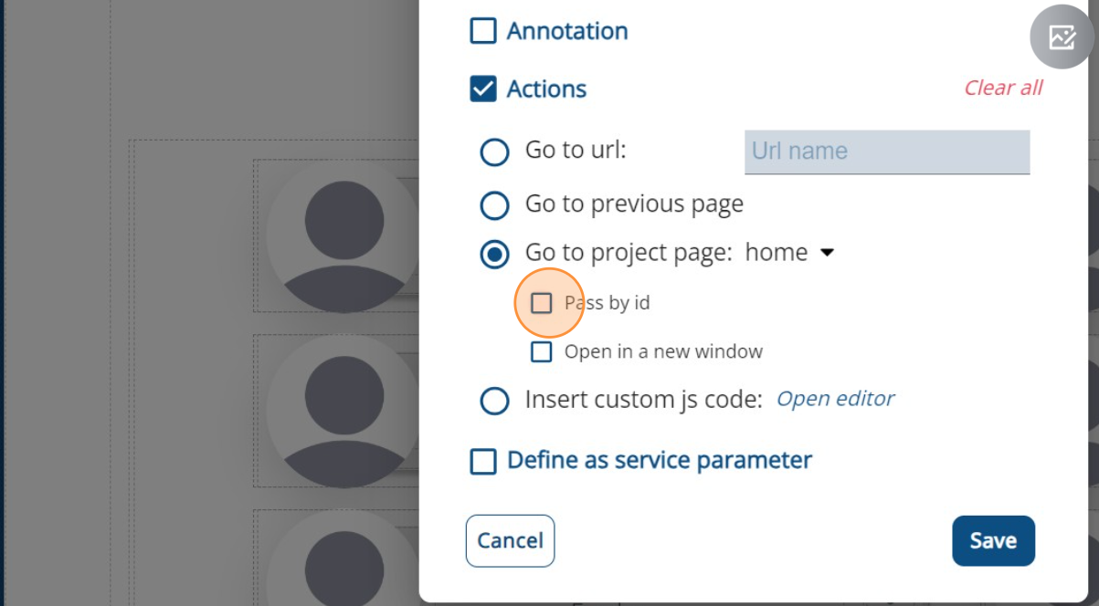
Link Page
Actions
Go to Project Page

Pass ID

When establishing links between pages, it's crucial to factor in the data you intend to transfer to the next page. If the subsequent page involves a "get" function – which can be explored in the Annotations section – or simply put, if it's going to display data related to a specific object like a user or a post, you should select the 'pass by id' option. This ensures that the relevant data is effectively carried forward for a seamless user experience.
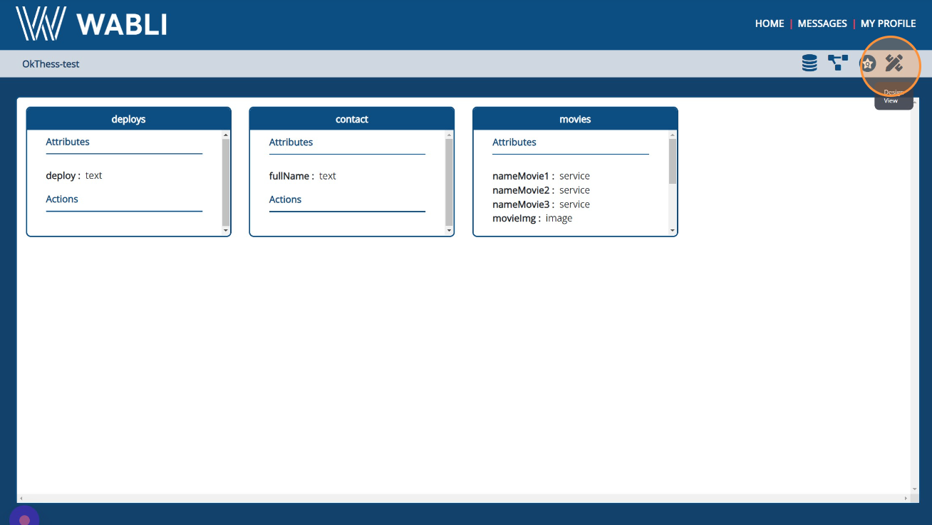
Pass ID

Annotations

This section pertains to defining your data model. This is achieved by specifying which elements of your website will be dynamically allocated. To accomplish this, you choose the text, images, or any other content you wish to display, and then opt for the annotation option.

Entities

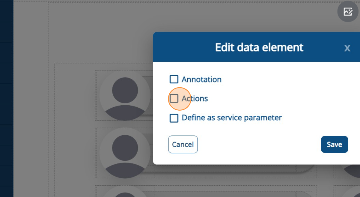
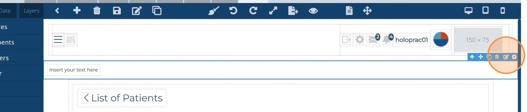
Before saving your annotation, it's important to understand the concept of an entity.

An "entity" is like something you want to remember and talk about. In a database, it could be a user, a blog post, or anything else you want to keep track of. It has specific qualities called attributes, like a user's name or a post's title.

So, when you annotate, you're defining the attributes for that entity. For instance, if you select a user's name and want to annotate it, you would choose the "user" entity and assign a name attribute, like "username." This process helps organize and structure the information you're working with in the database that WABLI will create for you.

Attributes

As it has already been discussed, an "attribute" is a specific piece of information that describes an entity within a database. It provides details about the entity's characteristics or properties. Here are the attribute types available to choose:

  • Text: Represents textual data like names, descriptions, or alphanumeric information.
  • Image: Holds URLs or references to image files associated with an entity.
  • Number: Deals with numerical data such as quantities, ages, or ratings.
  • Password: Used to securely store sensitive information like user passwords.
  • Email: Stores email addresses while ensuring correct formatting.
  • Entity: Represents relationships with other entities, creating associations within the database.
  • Date: Used for storing specific dates or date-time information.
  • Checkbox: Represents binary choices, often used for yes/no or true/false scenarios.
  • Radiobox: Similar to a checkbox, used when only one option can be selected from a group.
  • Service: Refers to external services or APIs linked to an entity.

CRUD Operations

When creating a new entity, WABLI automatically creates all the possible methods you might need in your project. This includes CRUD Operations.

CRUD stands for Create, Read, Update, and Delete, which are the fundamental operations used to manage data in a database or any kind of data storage system. These operations are the core functionalities for interacting with data and maintaining its integrity. Here's a brief description of each CRUD operation:

  1. Create: Adding new data or records to the database.
  2. Read: Retrieving or accessing data from the database.
  3. Update: Modifying existing data in the database.
  4. Delete: Removing data from the database.

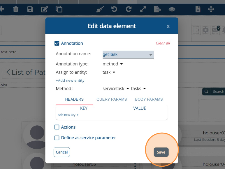
Once you've defined all the attributes for your entities, the next step involves annotating all the buttons responsible for creating, updating, or deleting objects of an entity when the user interacts with them. Additionally, you should utilize the "get" methods in the blocks that contain information. Annotate these blocks and select the "getAll" method to retrieve all objects of that entity, and use the "get" method to retrieve a specific one.

This annotation process ensures that your application seamlessly interacts with the data you've defined in your entities, enabling users to perform actions and retrieve information as intended.

Get By Params

In addition, WABLI also provides a "getByParams" method. This functionality allows you to retrieve objects of an entity that meet specific conditions. For instance, when fetching posts, you can use this method to only retrieve posts where the attribute "category" is equal to "sports."

This feature empowers you to retrieve targeted data based on customized criteria, enhancing the precision and relevance of the information you access from your database.
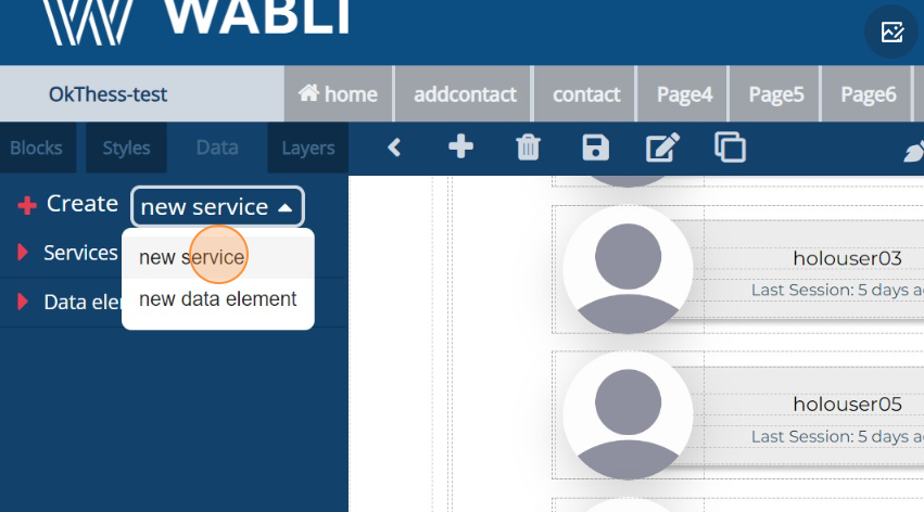
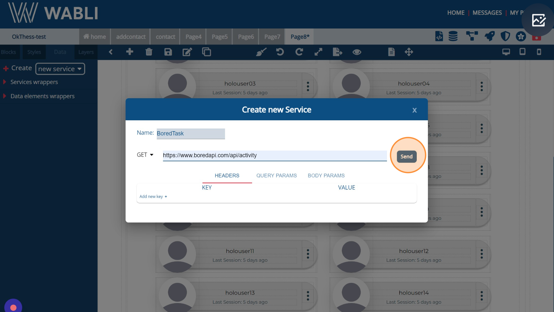
Services

WABLI provides you with the capability to seamlessly integrate your web application with external services. This empowers you to fetch data from various sources and present it to users within your application. This connectivity allows you to enrich your app with diverse and dynamic information, enhancing the user experience by incorporating data from external sources.

New service

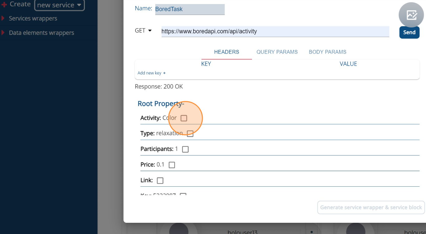
To create a new service, navigate to the 'Data' Tab located in the left-side menu. Click on 'New Service', and then provide a name and link for the service. Afterward, click 'Send' to confirm. With the service established, you can select the specific data you wish to retain from this service. Click 'Save' to proceed, subsequently enabling you to showcase the chosen data to your users. This process ensures that you can seamlessly integrate external data sources into your application.

Click Data
New service
Send service
Select Property

Present data to user

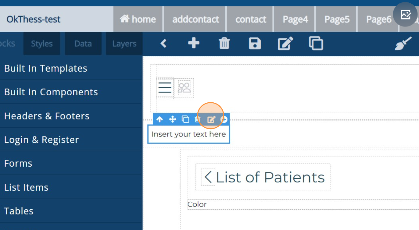
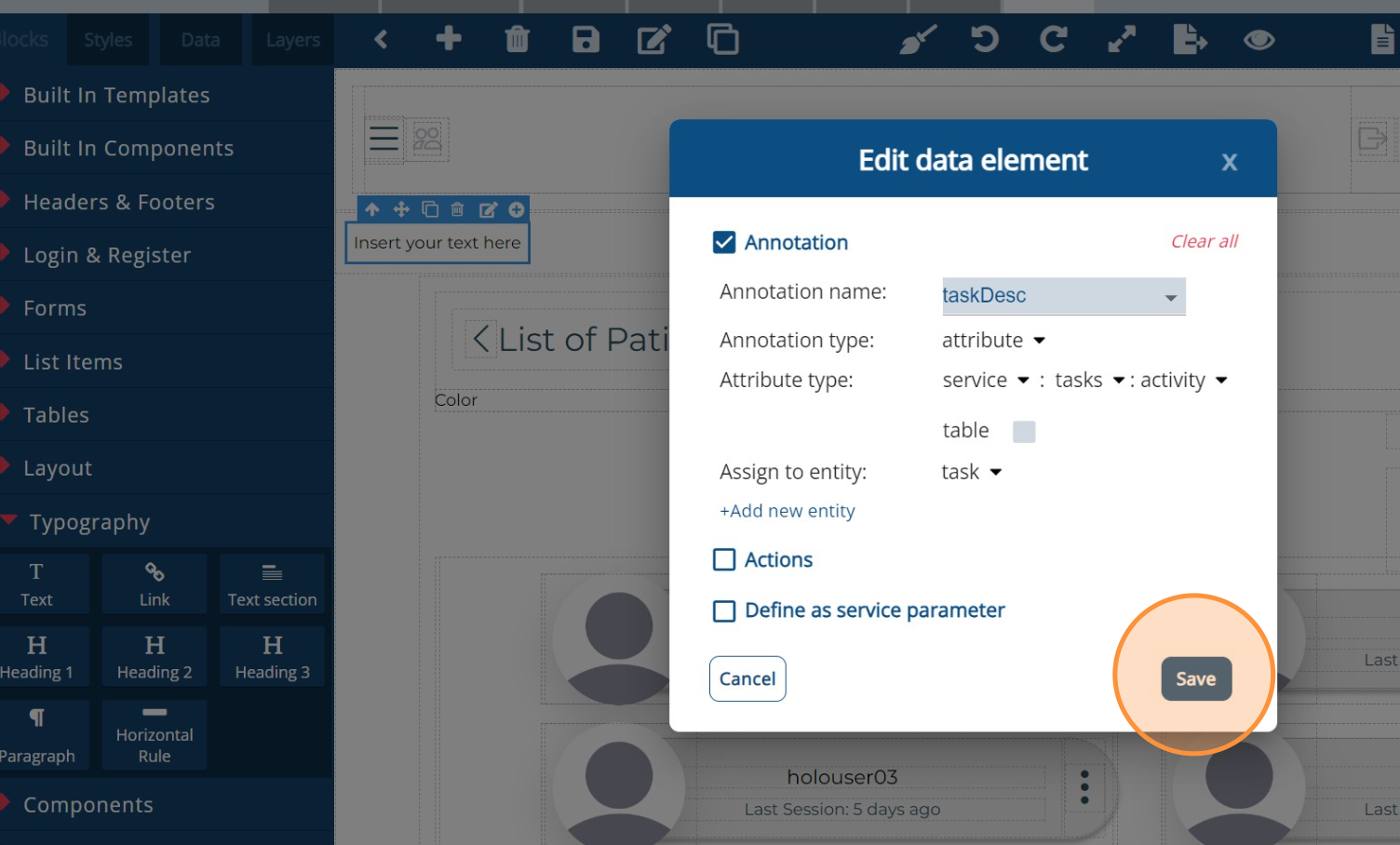
To display data from the service to users, simply employ the annotation method. This involves annotating each text block that will exhibit the results. Assign an annotation type of "attribute," attribute type of "service," and select the specific data you wish to display. Following this, choose the parent block containing these text blocks and apply an annotation type of "method" along with the service method. Consequently, the service will execute each time the user accesses the page, ensuring that the most up-to-date data is consistently presented to users.

Annotate text
Save text annotation
Annotate Box
Save box annotation

Use parameters

Lastly, an important capability is the ability to include parameters in a service, which can be added to headers, query parameters, or body parameters. To accomplish this, while adding or editing a service, select the type of parameters you intend to incorporate. Then, click on "Add New Key" to include a key along with its corresponding value. This feature facilitates the customization and interaction with external services, allowing you to send specific information and retrieve tailored data as needed.
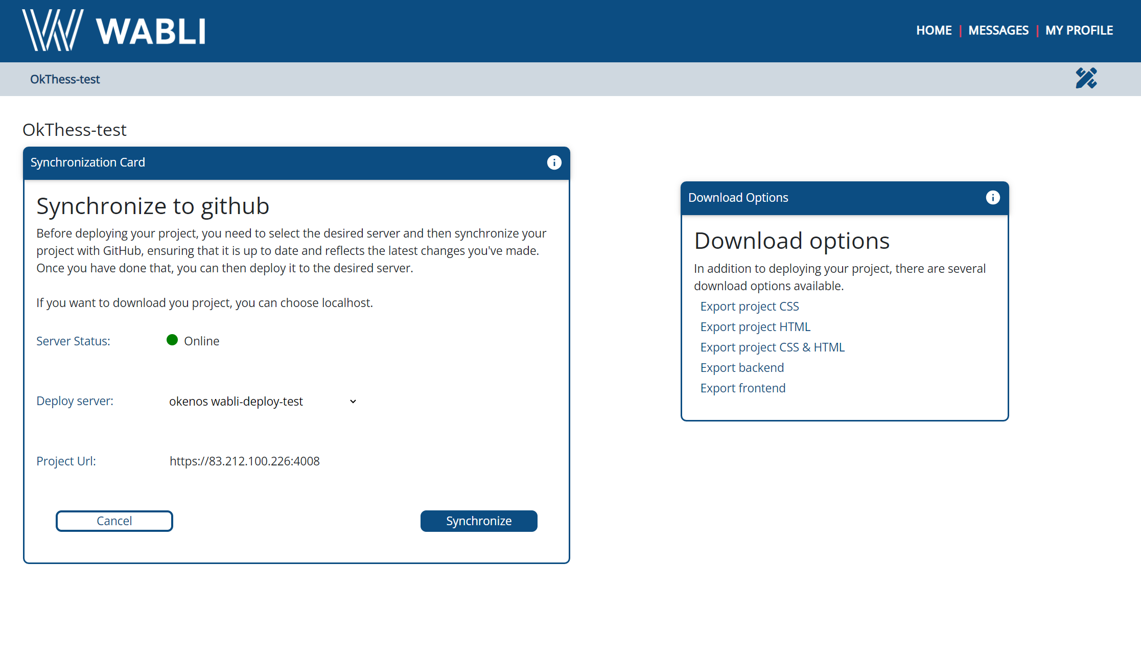
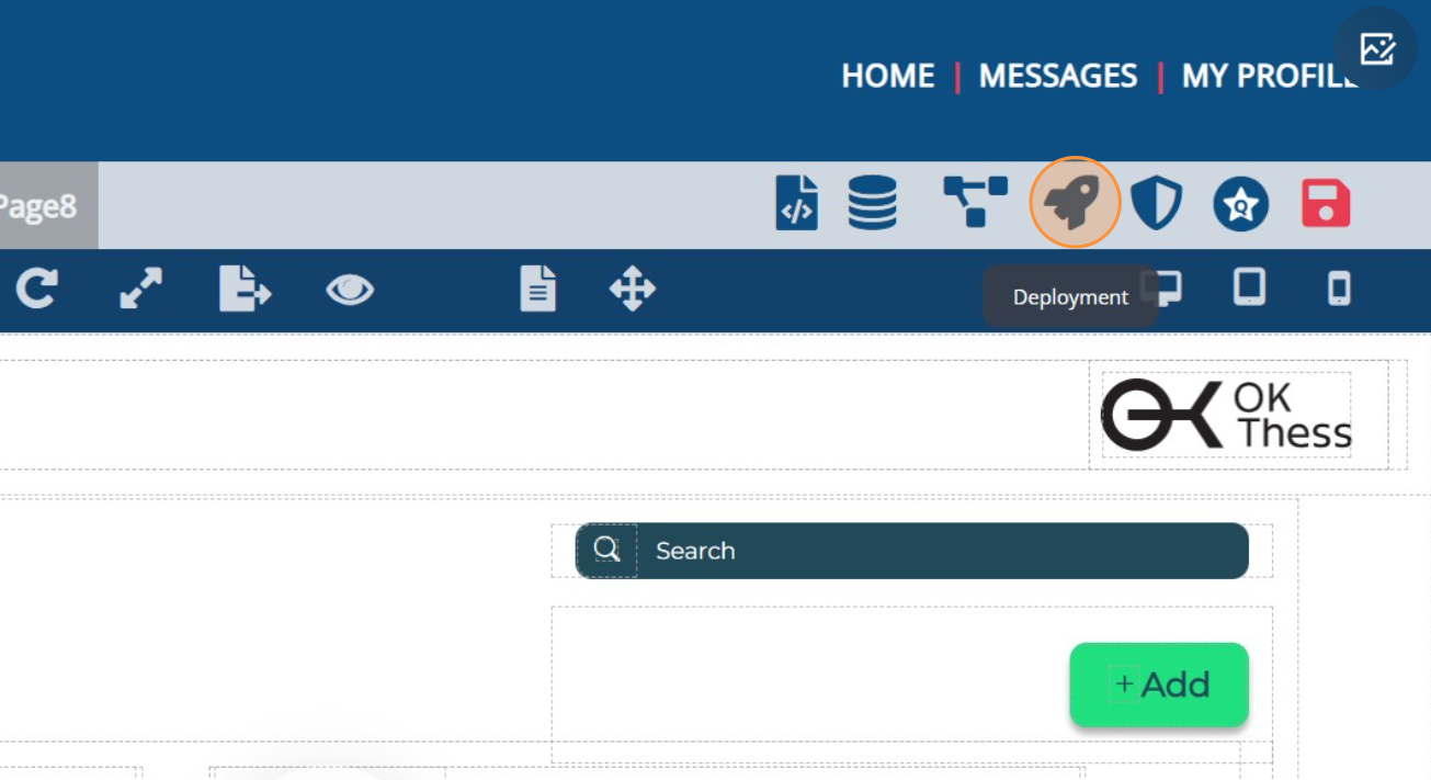
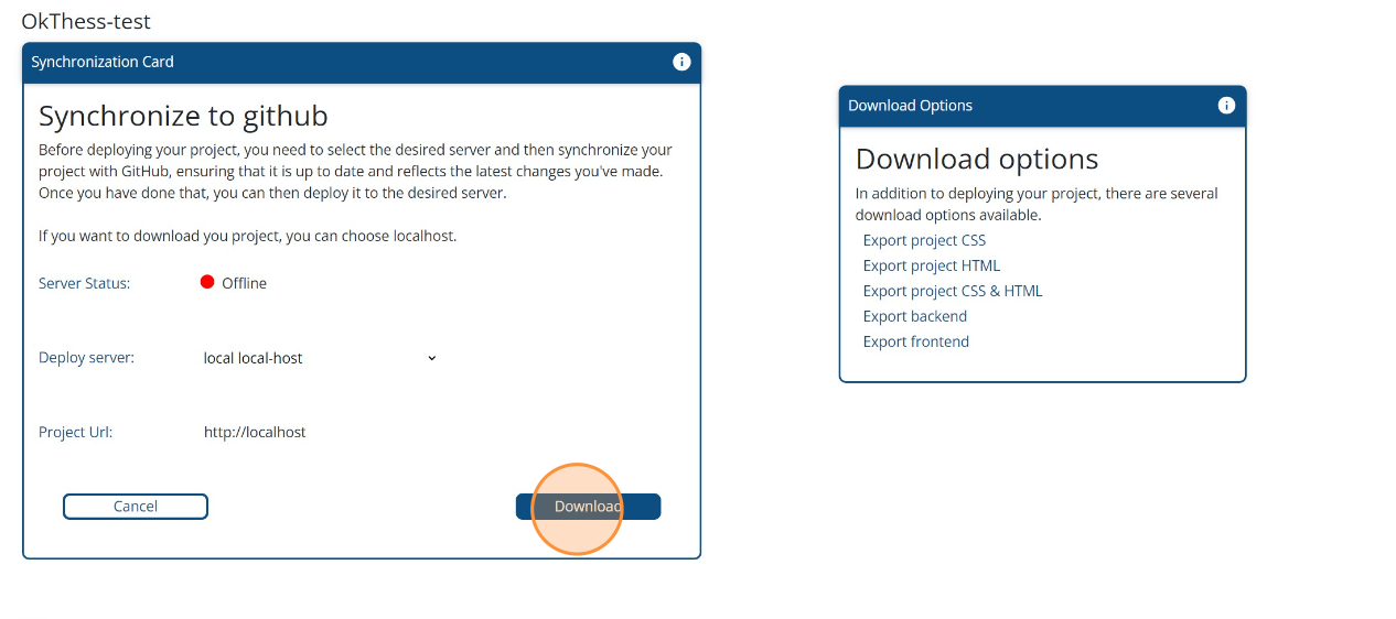
Deployment

What sets WABLI apart from other low-code platforms is its unique feature that allows you to download your code at any time. You have the flexibility to download the HTML and CSS components separately, or alternatively, you can opt for WABLI to combine everything into a complete project. This complete project encompasses both the frontend and backend, featuring a pre-configured database based on your data model and a functional backend API ready for use by the frontend. This versatility empowers you to take full control of your project and continue its development independently without the need of any platform.

Absolutely, if you prefer to experience your project in action without downloading the code, WABLI offers a seamless solution. With just two clicks, you can make your project live. Begin by syncing your project with your GitHub account, and then deploy it to the server furnished by the WABLI team. This uncomplicated process enables you to swiftly share your project with the world, enabling quick and effortless showcasing within a matter of minutes.

Download code

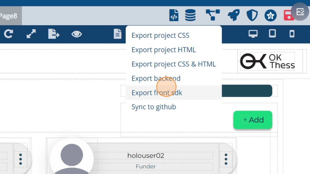
To download your code, simply click on the rocket icon located in the upper right menu. This action will navigate you to the deployment page, where you can choose to download specific sections of your code or opt for the complete project download.

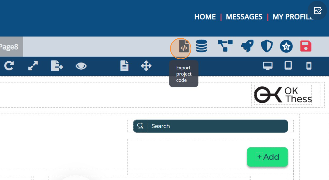
Additionally, you have the option to view the live code at any point. While on any page, simply click on the 'Export code' icon located in the upper middle menu. This action allows you to instantly access and examine the HTML, CSS, and JavaScript code associated with that specific page. This real-time code visibility facilitates a deeper understanding of your project's inner workings and aids in troubleshooting or customization as needed.

Click Export Project Code
exportfrontsdk
Deployment Page
Download Project

Sync to Github

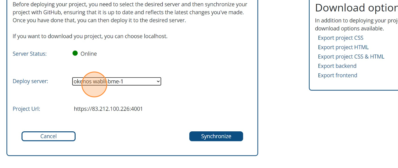
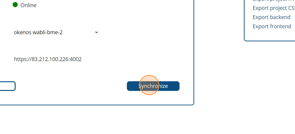
As mentioned earlier, to deploy your project to a server, you must first upload it to your GitHub account. Follow these steps: Begin by accessing the deployment page through the rocket icon in the upper right menu. Once the settings load, choose the desired deployment server, and then click 'Synchronize'. With this straightforward process, your project will be successfully uploaded to GitHub, ready for further deployment.
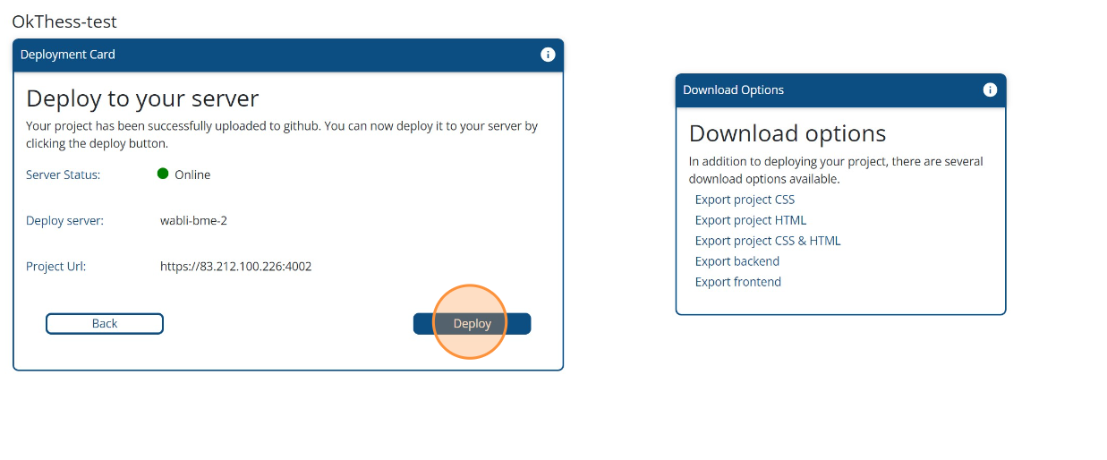
Go To Deployment Page
Select Project Server
Sync to github

Deploy to server

Once you have synchronized your project with GitHub, you'll notice the presence of the 'Deploy' button. Click on this button, and your project will now be live and accessible on the server you've chosen for deployment. This streamlined procedure ensures that your project is swiftly brought to life and available for users to interact with. Visit the displayed address or share it with others to allow them to access and explore your project.
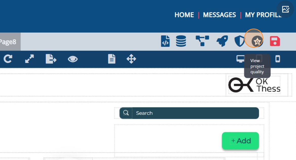
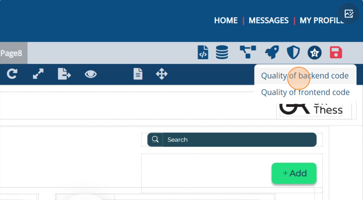
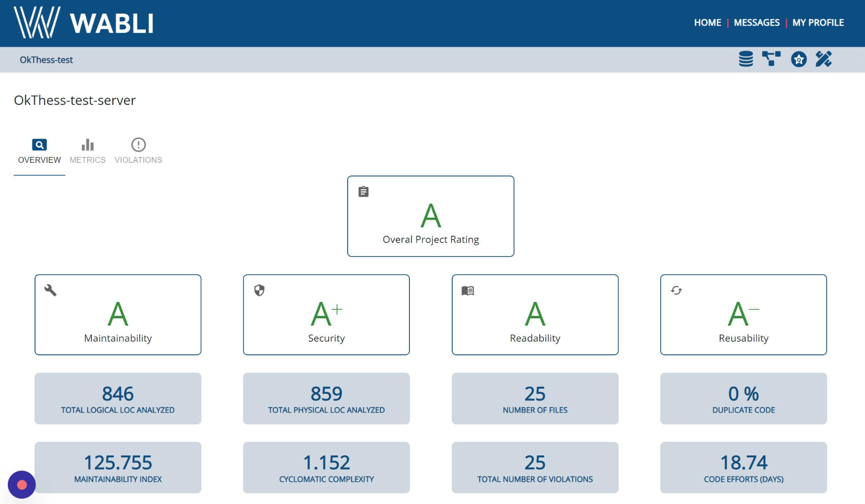
Deploy Project

Quality Assurance

The distinctive capabilities of WABLI extend even further. Another crucial aspect in web application development is assessing the quality of your code in terms of speed, scalability, security, and identifying errors and warnings. With WABLI, you can perform all these checks effortlessly with just a single click. This feature empowers you to ensure that your code meets the highest standards for performance, reliability, and safety.

Back-end quality

To evaluate the quality of your backend code, click on the star icon located in the upper right menu and choose the "Quality of Backend" option. If you've already synchronized your project with GitHub, the results will be displayed shortly. Take the time to navigate through the results to identify potential warnings and suggested fixes. This process enables you to enhance the reliability and efficiency of your backend code by addressing any issues that may arise.

Go To Quality Page
Select Backend
Results

Front-end quality

To assess the quality of your frontend code, click on the star icon located in the upper right menu and choose the "Quality of Frontend" option. If you've previously synchronized your project with GitHub, the results will be promptly displayed. Take the time to explore the results and navigate through any potential warnings and suggested solutions. This process empowers you to optimize the performance and reliability of your frontend code by addressing any issues that may arise.